Creating a Playful and Engaging Brand Identity
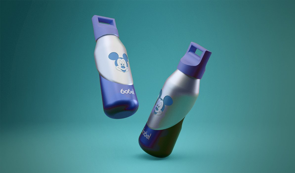
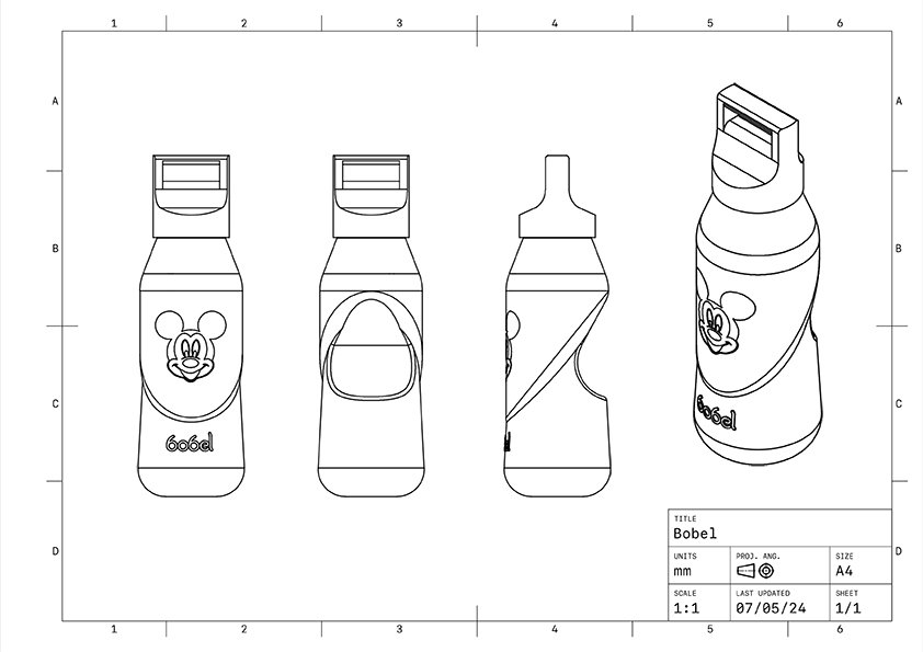
For this project, I designed a logo for “Bobel,” a unique drinking bottle brand that features character shapes inside the bottle. The aim was to create a logo that reflects the fun and innovative nature of the product, making it appealing to both children and adults who enjoy playful and creative designs.
Project Highlights
Concept Development
The concept for the logo was to highlight the playful and fun aspects of the Bobel bottle. The design needed to capture the essence of enjoying a drink in a unique and entertaining way.
Logo Design
The logo features a bold and rounded typeface that is both friendly and approachable. The playful design elements reflect the fun experience of using the Bobel bottle.

Typography
Used a bubbly and rounded font to create a friendly and approachable look. The typography aligns with the playful nature of the product and enhances the overall brand identity.
Tagline
Added the tagline “Drink the fun way” to encapsulate the brand’s philosophy. The tagline reinforces the idea that drinking from a Bobel bottle is a delightful and enjoyable experience.
Result
The final logo successfully captures the essence of “Bobel” – a brand that transforms the simple act of drinking into a fun and engaging activity. The playful design, bright colors, and creative typography create a memorable and appealing identity that resonates with the target audience. This project highlights my ability to combine creativity with strategic thinking to create a logo that effectively communicates the brand’s values and mission.